Every brand is a
layered journey—
each thoughtful
step refining meaning,
message, and
human connection.
DESIGN ON THE ROCKS
Building a start-up brand identity for a
bartending and catering service.
PROJECT ( 05/08 )
01_COURSE
GR365 BRANDING STRATEGIES
02_INSTRUCTOR
PETER CHUN
03_TERM
SPRING 2025


{ LAYER 01_OBJECTIVE }
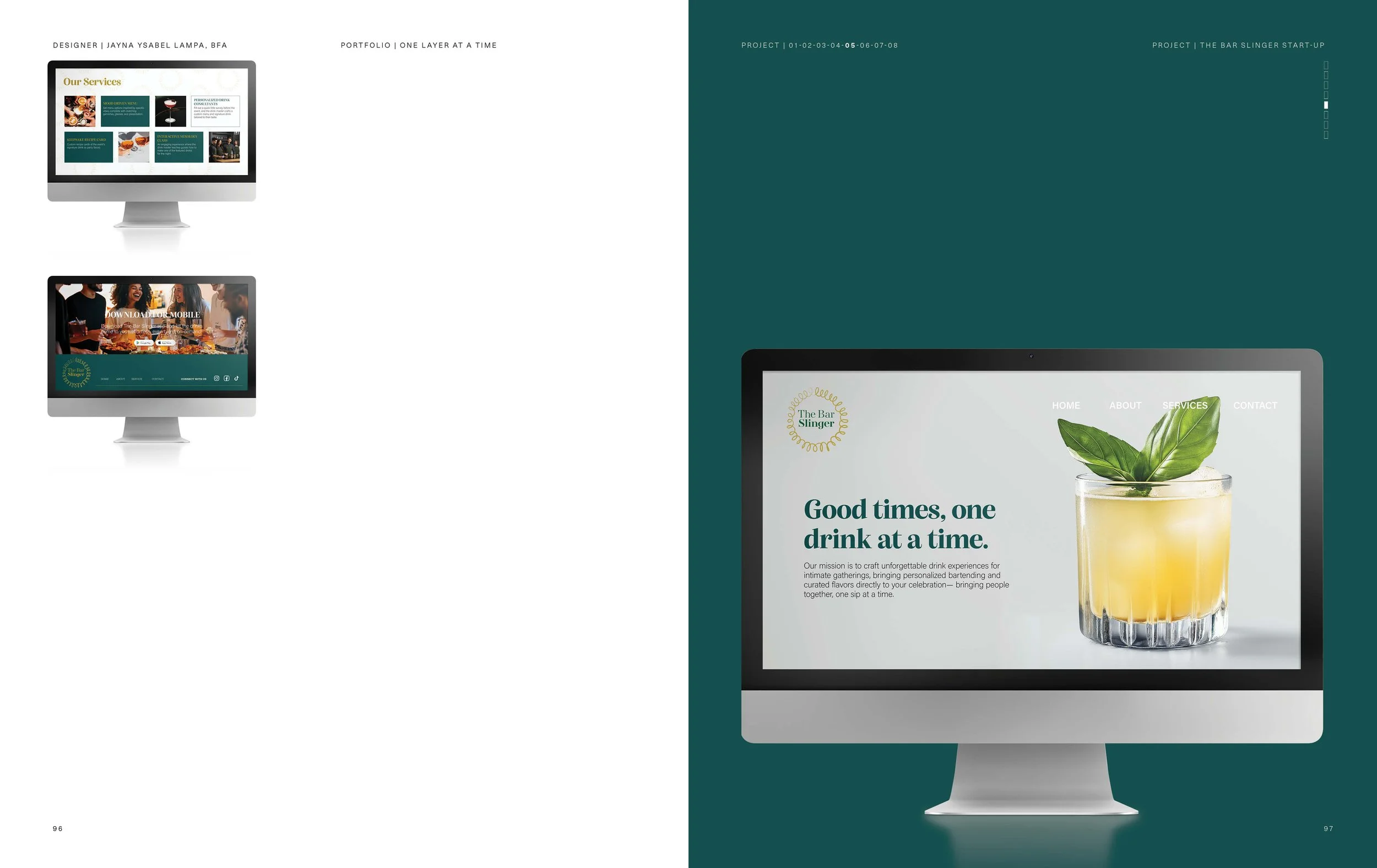
Design a start-up brand identity that captured the unique
offering of The Bar Slinger. I aimed to create a brand that felt
premium, approachable, and memorable, aligning with
the company’s mission of elevating small gatherings into
meaningful experiences.
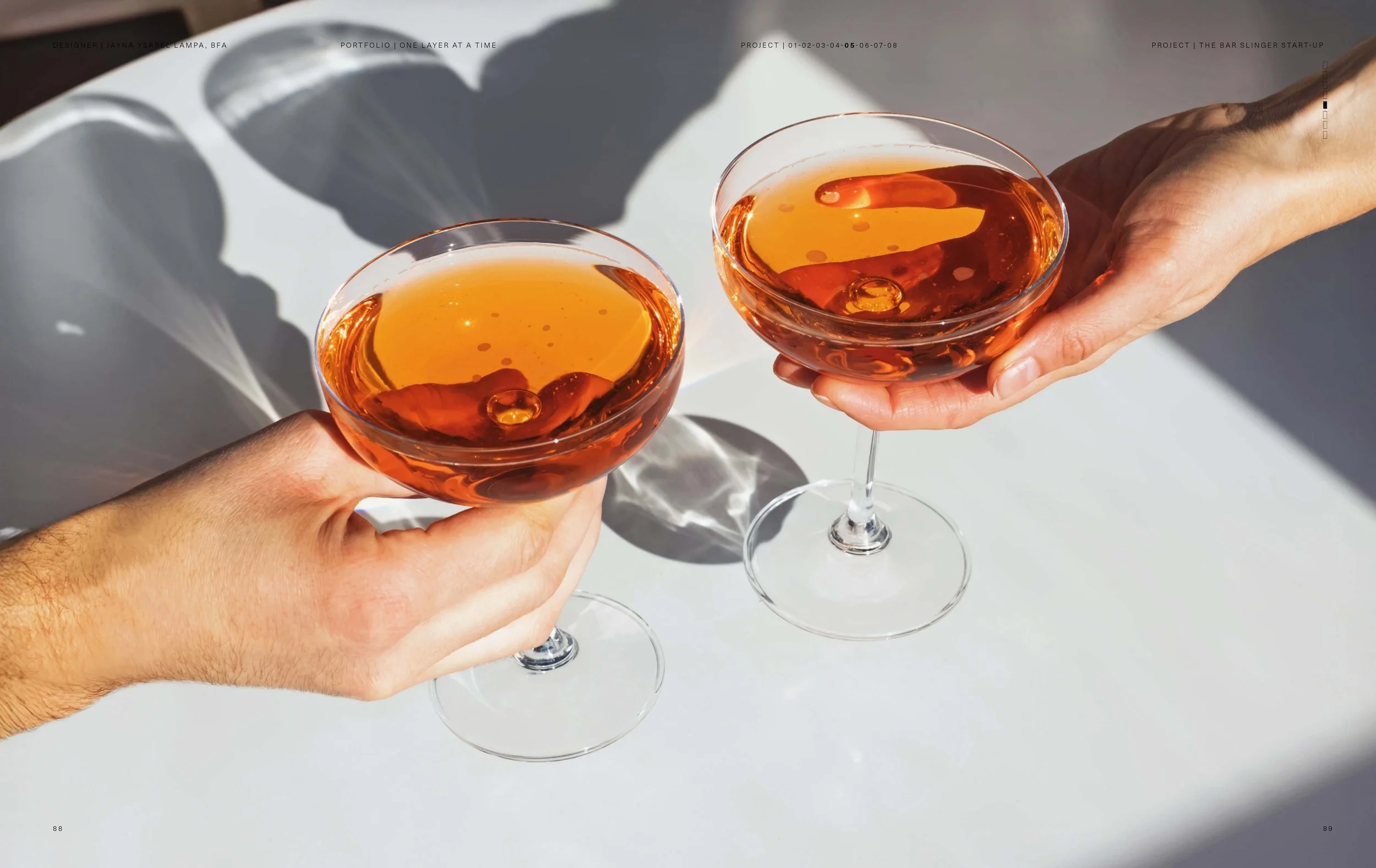
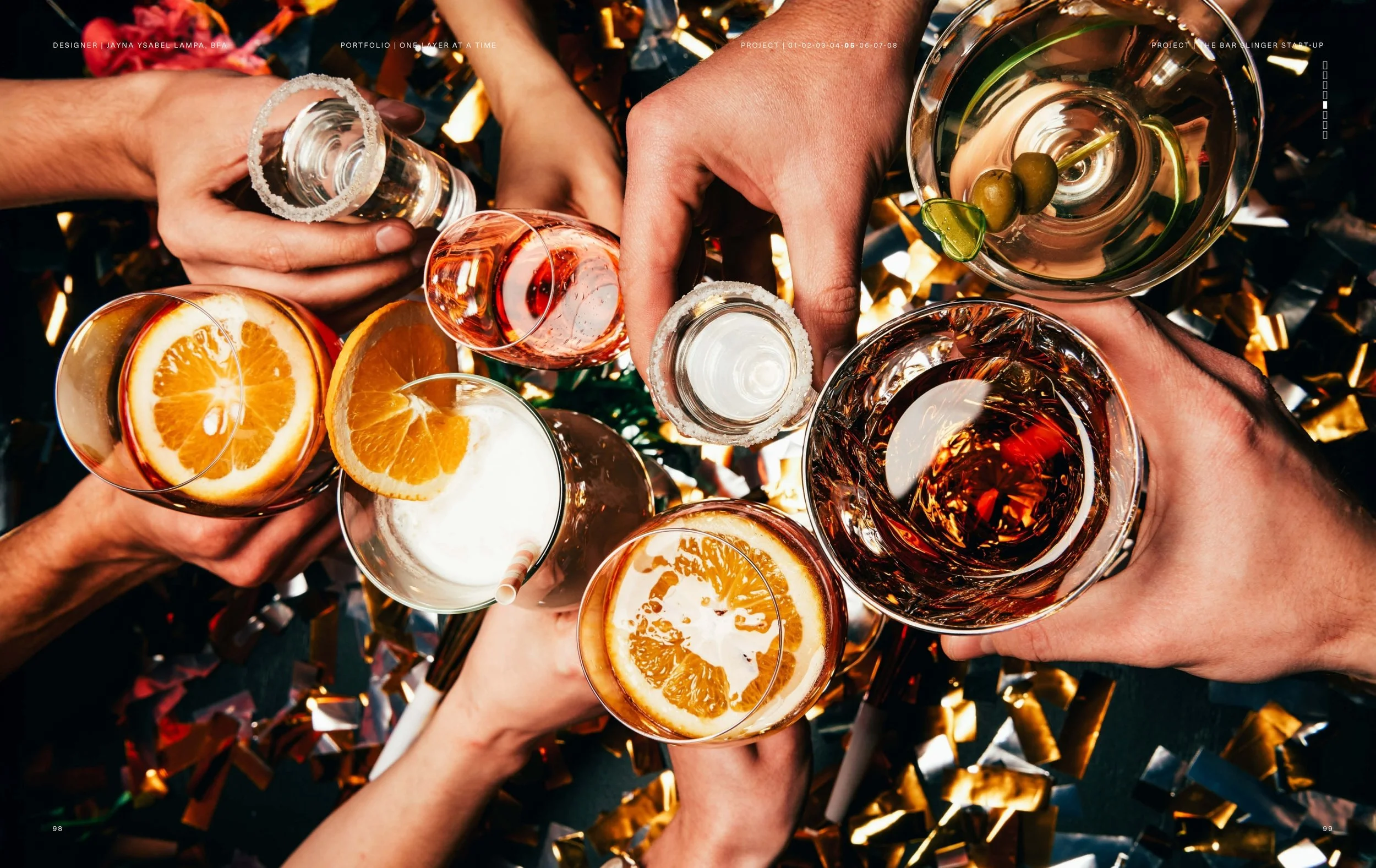
{ LAYER 02_PREMISE }
Branding can elevate a service beyond function into an
experience. By creating a strong, cohesive identity for The Bar
Slinger, I sought to highlight how design can transform an intimate
bartending service into a memorable, lifestyle-driven brand.
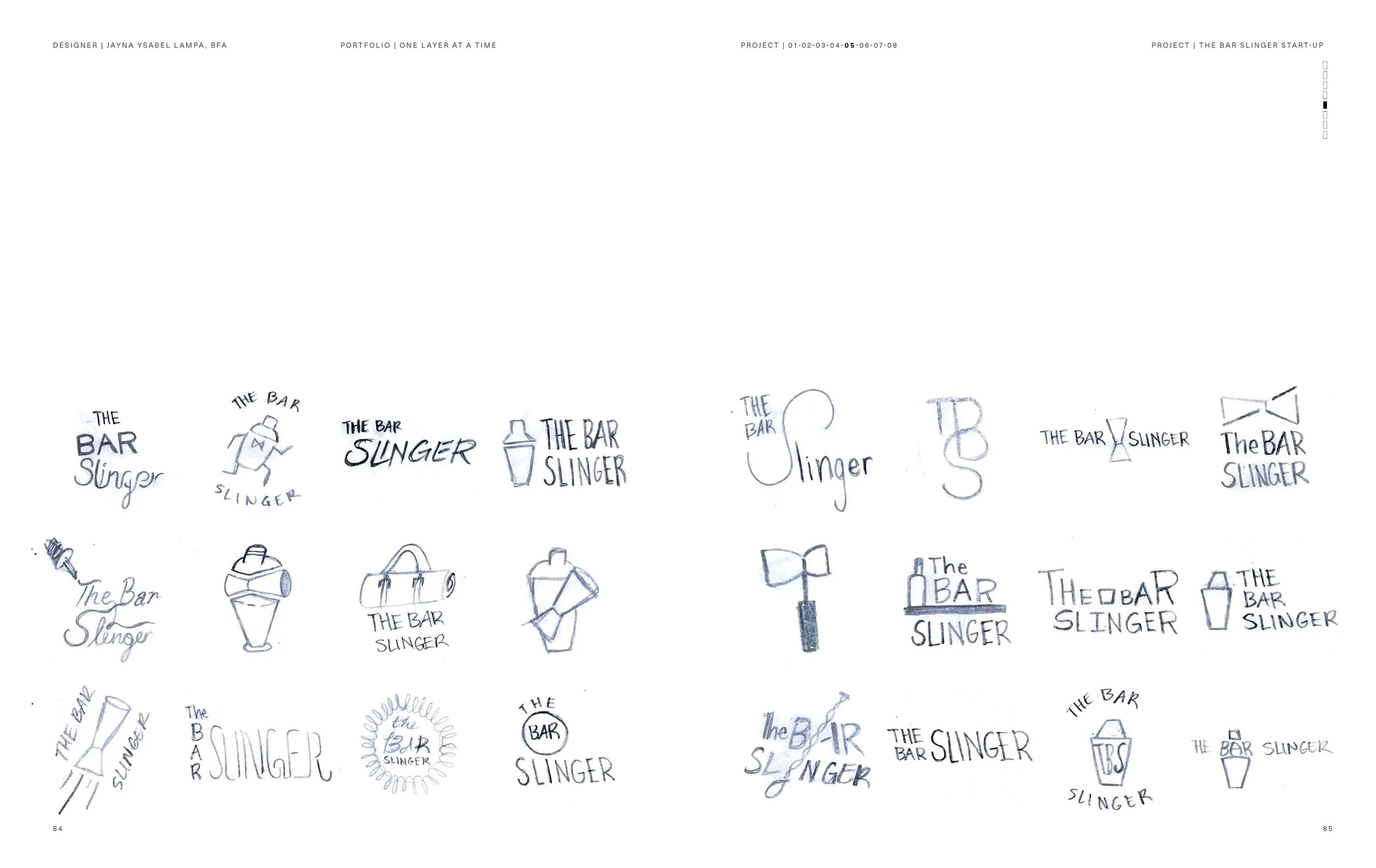
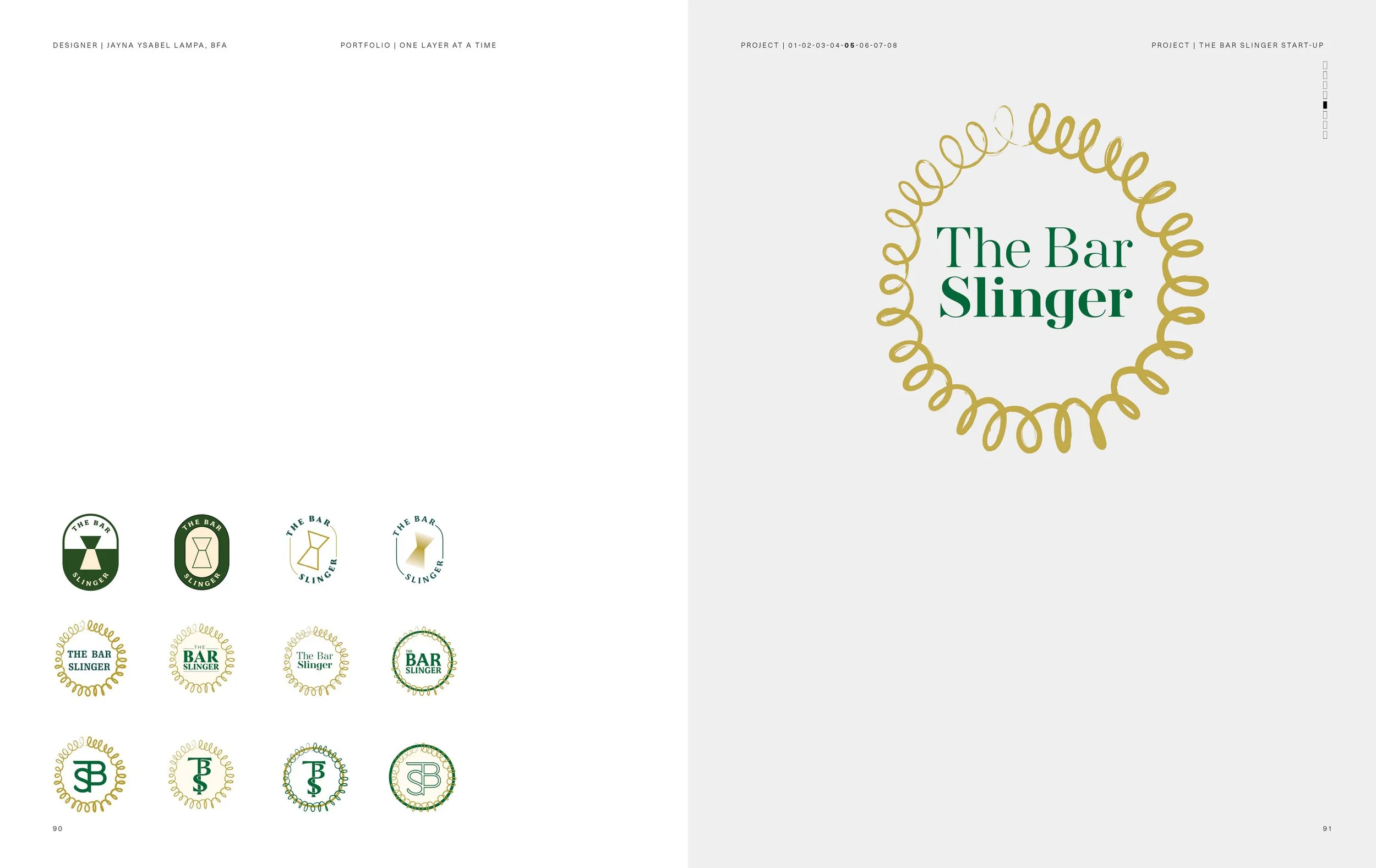
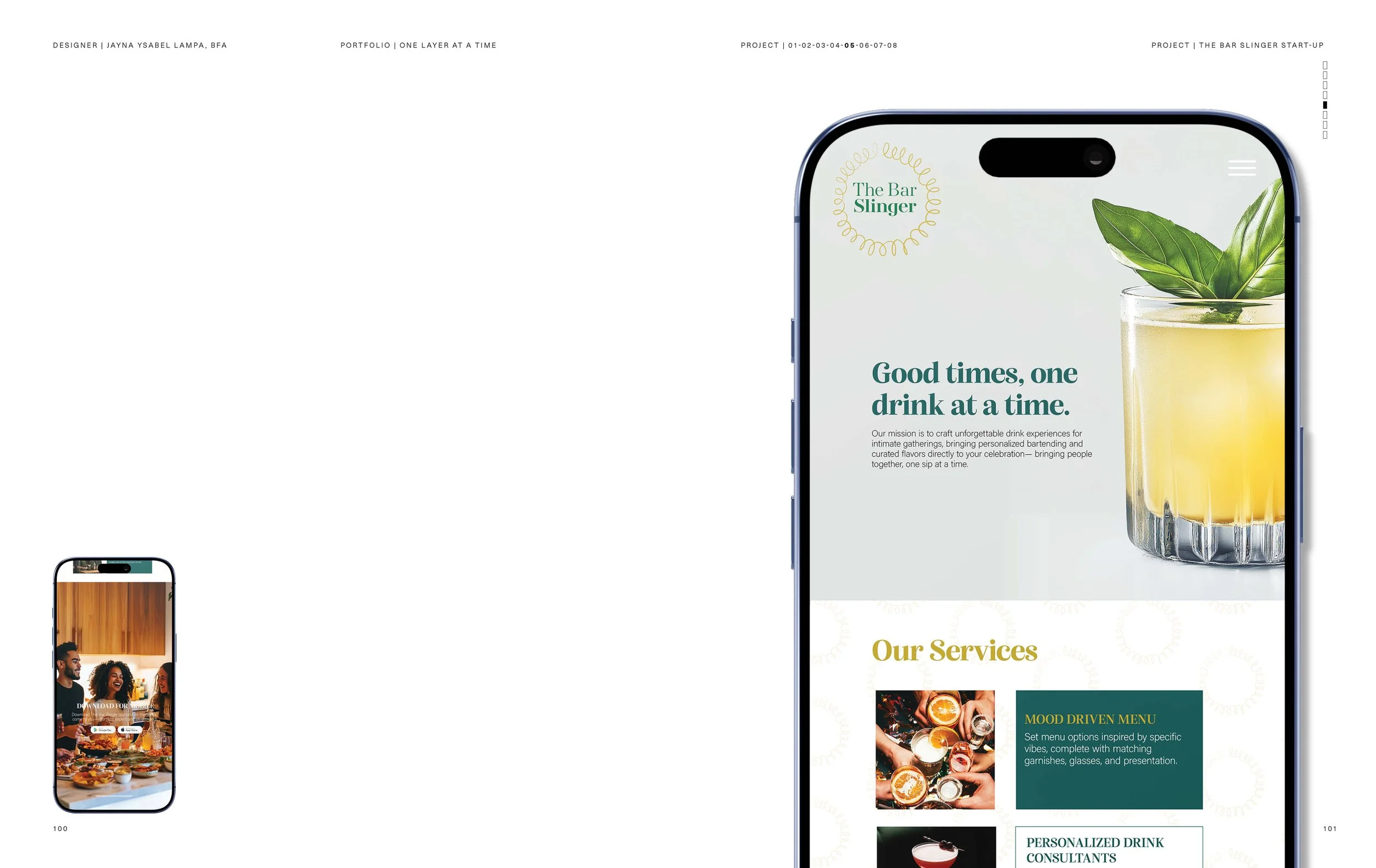
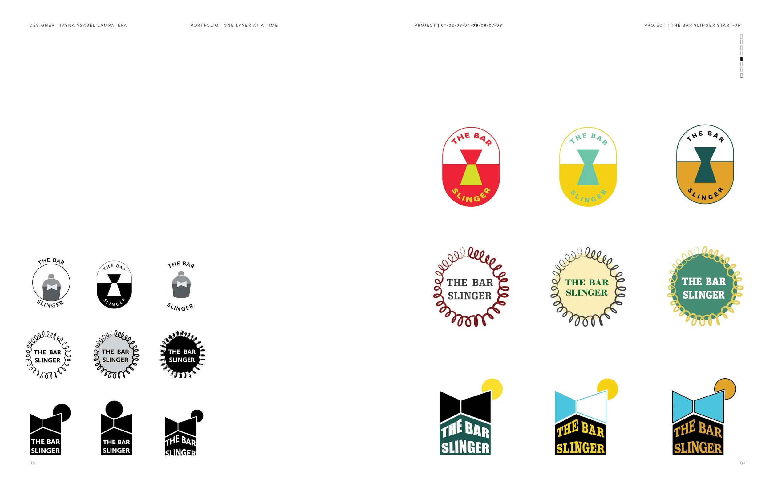
{ LAYER 03_DESIGN APPROACH }
My approach was to develop a visual identity system that
balanced sophistication with creativity. I started with the logo,
using bold yet clean typography to establish a strong
presence that reflected professionalism while remaining
approachable. Color choices were intentional: a deep green to
symbolize trust and craft, paired with a warm gold for a
touch of luxury and celebration.
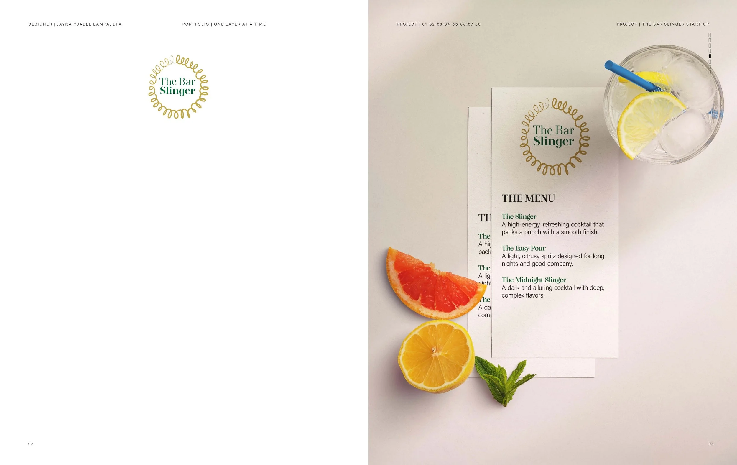
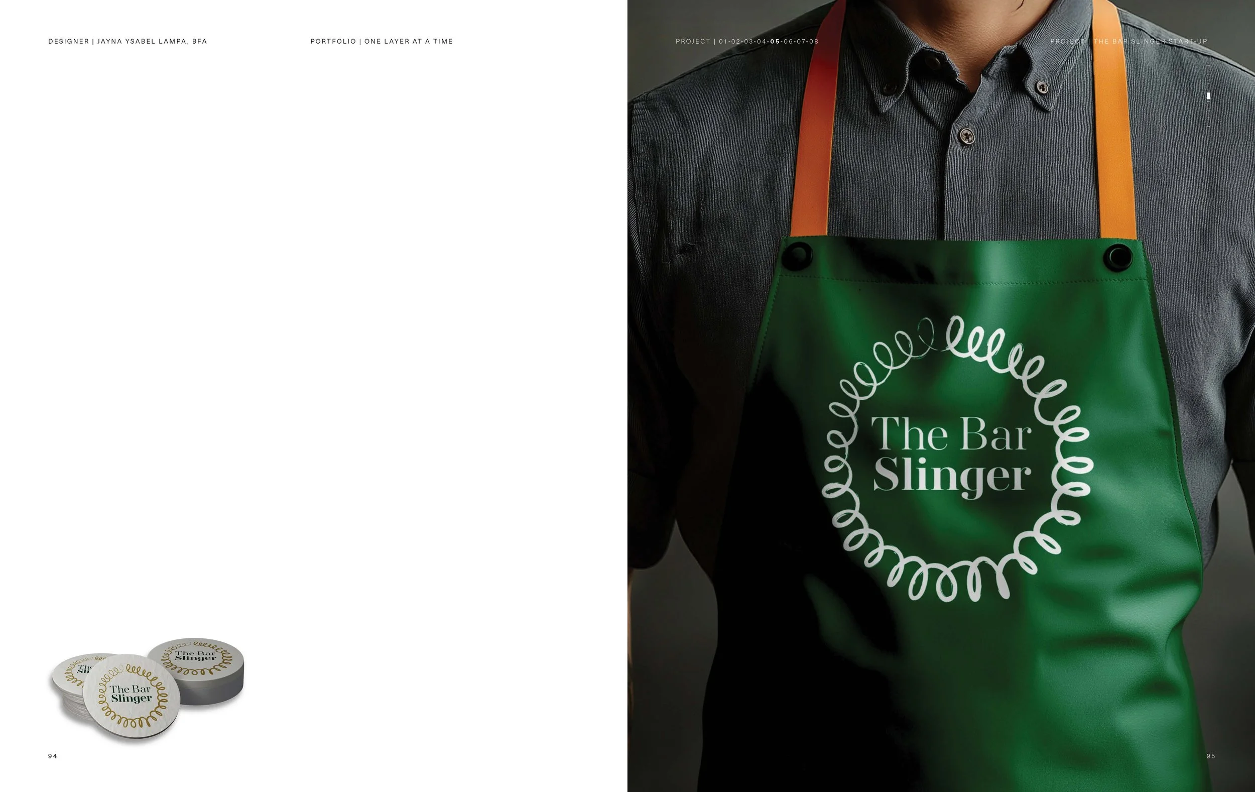
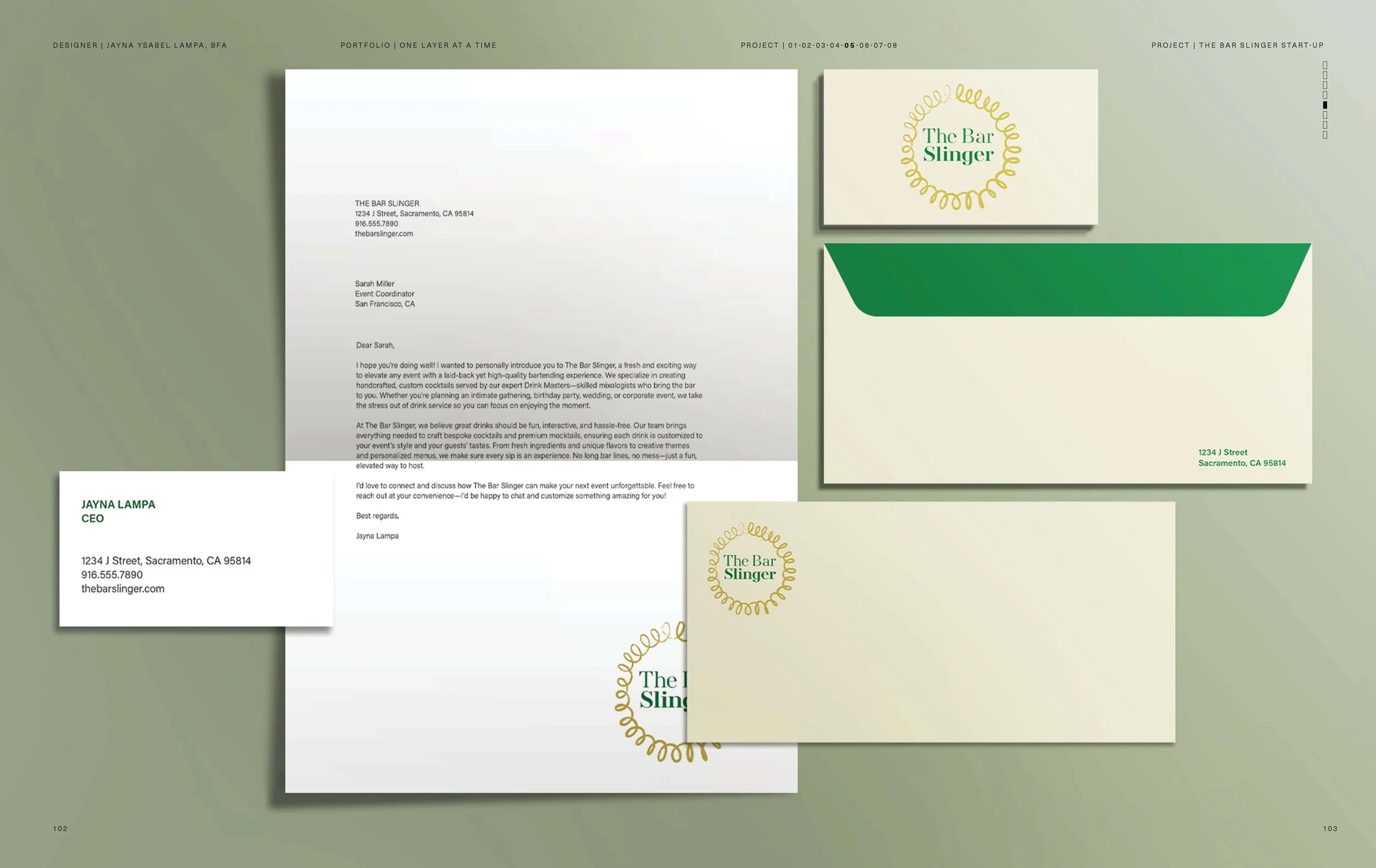
Typography pairings reinforced clarity while adding personality
to touch points like menus, recipe cards, and promotional
materials. Throughout the process, I focused on translating the
interactive, sensory nature of mixology into a cohesive
brand language.