Each redesign
uncovers the
hidden layers of
meaning, shaping
a brand that feels
both renewed
and remembered.
A NATURAL RENEWAL
A clean and natural logo redesign for
a small beauty brand.
PROJECT ( 04/08 )
01_COURSE
GR324 BRANDING PRINCIPLES
02_INSTRUCTOR
THOMAS MCNULTY
03_TERM
SPRING 2023

{ LAYER 01_OBJECTIVE }
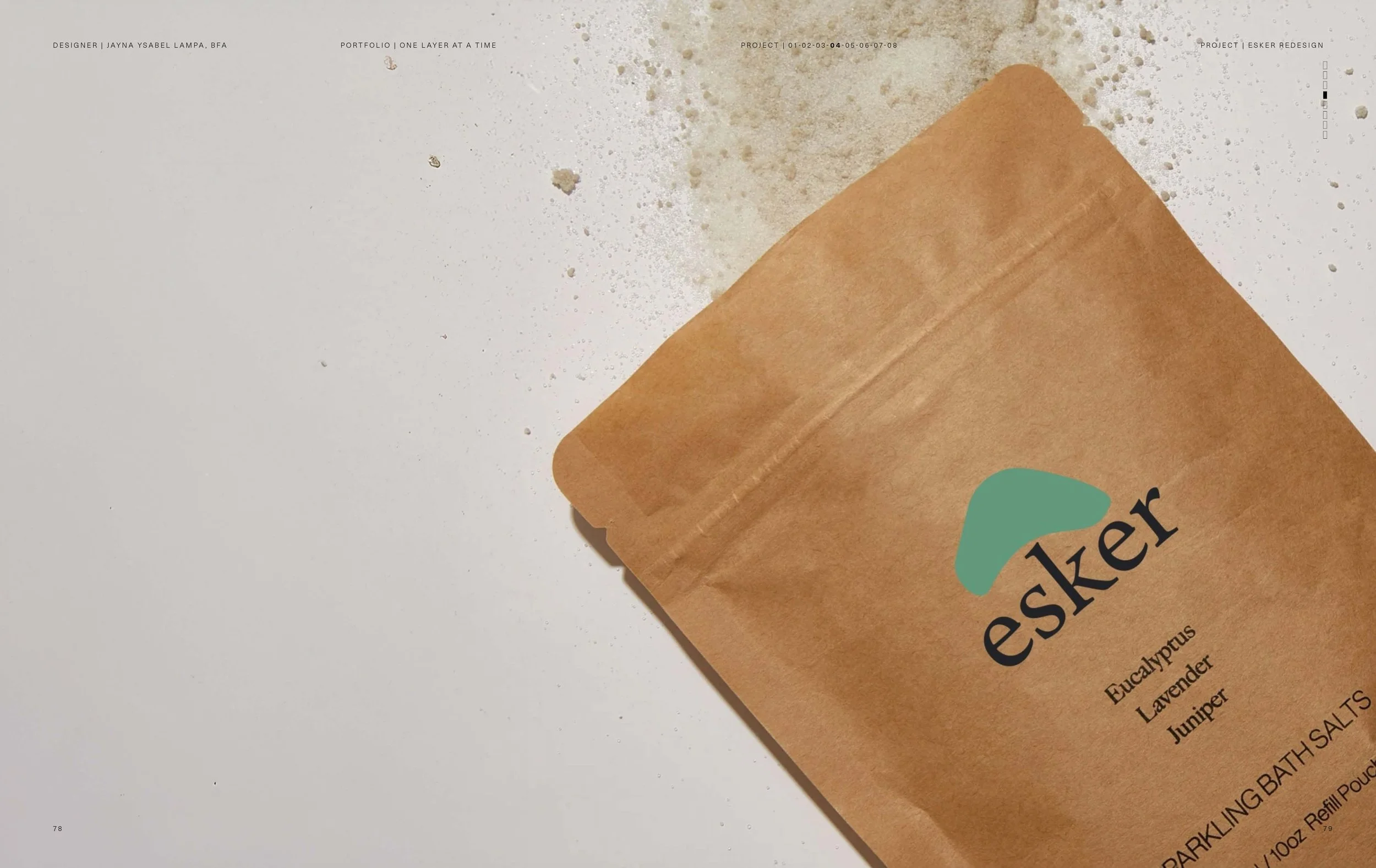
Redesign the logo of ESKER, a small beauty business, in
a way that better reflects its brand soul. I wanted the new identity
to align with the company’s mission of offering simple,
Earth-derived body care products that bring relaxation and relief
into people’s lives.
{ LAYER 02_PREMISE }
The premise of this project was that ESKER’s existing identity
needed refinement to visually communicate its integrity and
natural philosophy. By redesigning the logo, I aimed to give the
brand a stronger, more cohesive voice that resonates with its
audience and reinforces its place in the clean beauty industry.
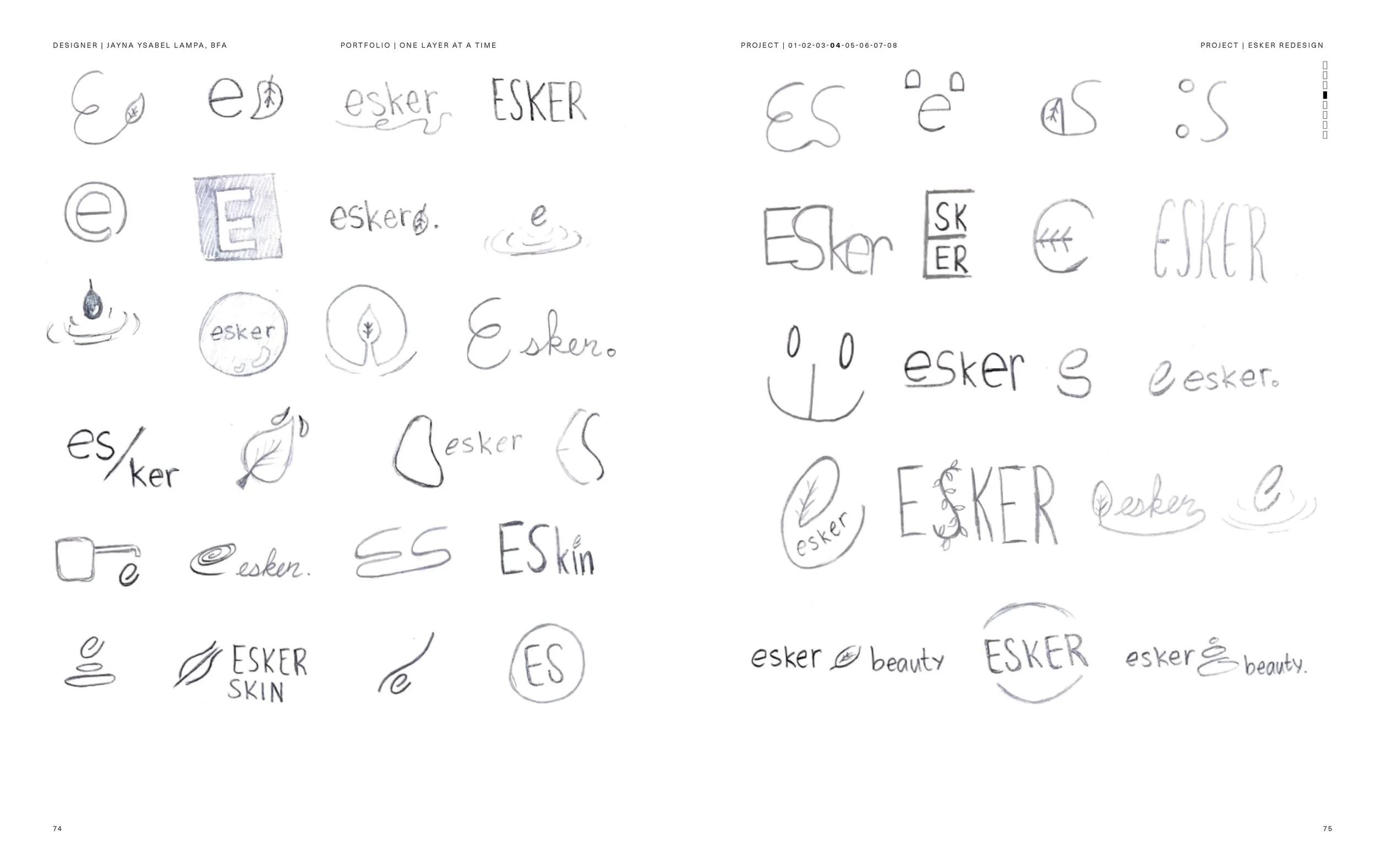
{ LAYER 03_DESIGN APPROACH }
My approach was to focus on clarity, simplicity, and alignment
with the brand’s natural philosophy. I began by studying
the brand soul keywords which guided my creative direction
throughout the process. I paid close attention to form and
typography, leaning into minimal shapes that felt organic and
approachable rather than overly stylized.
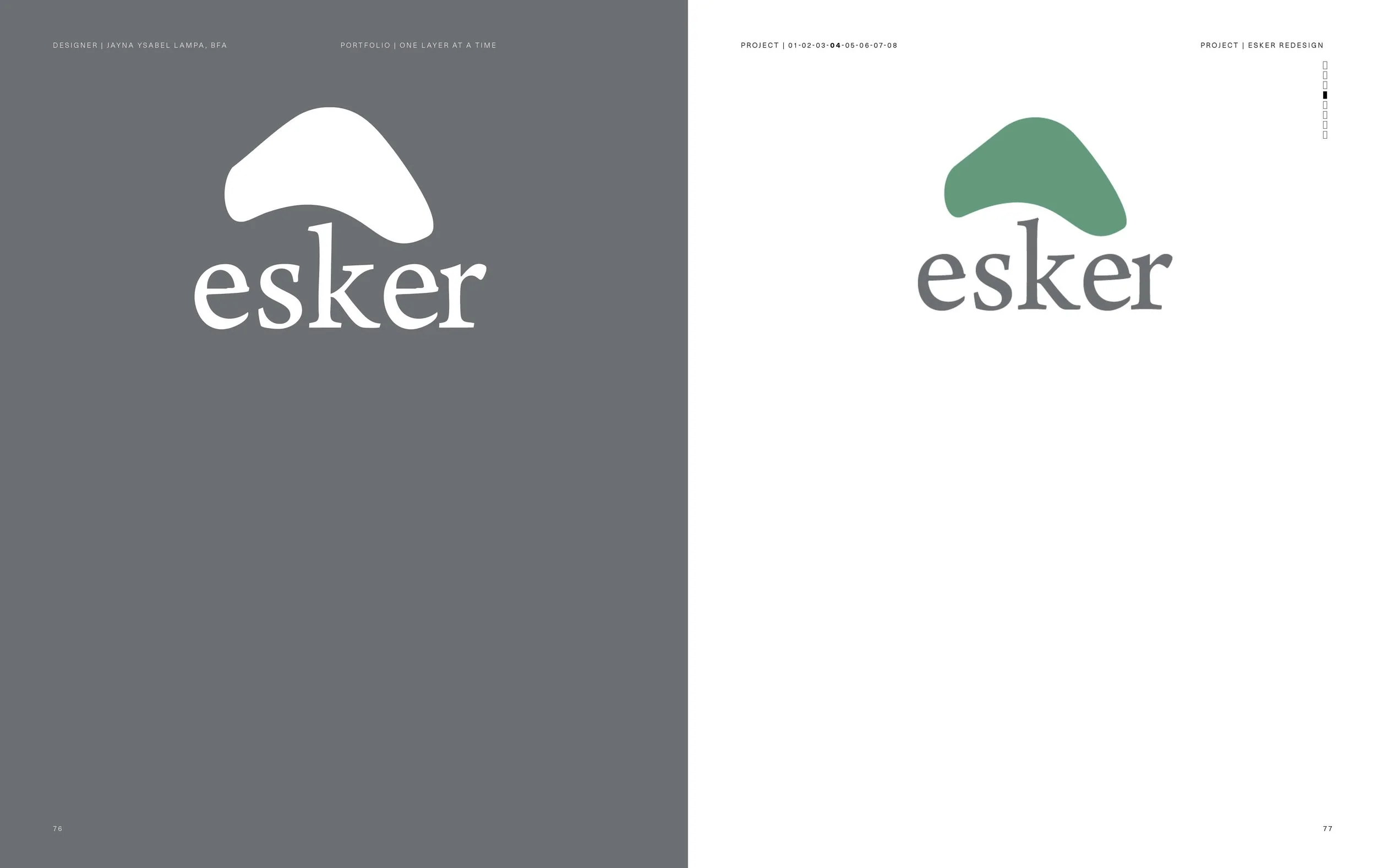
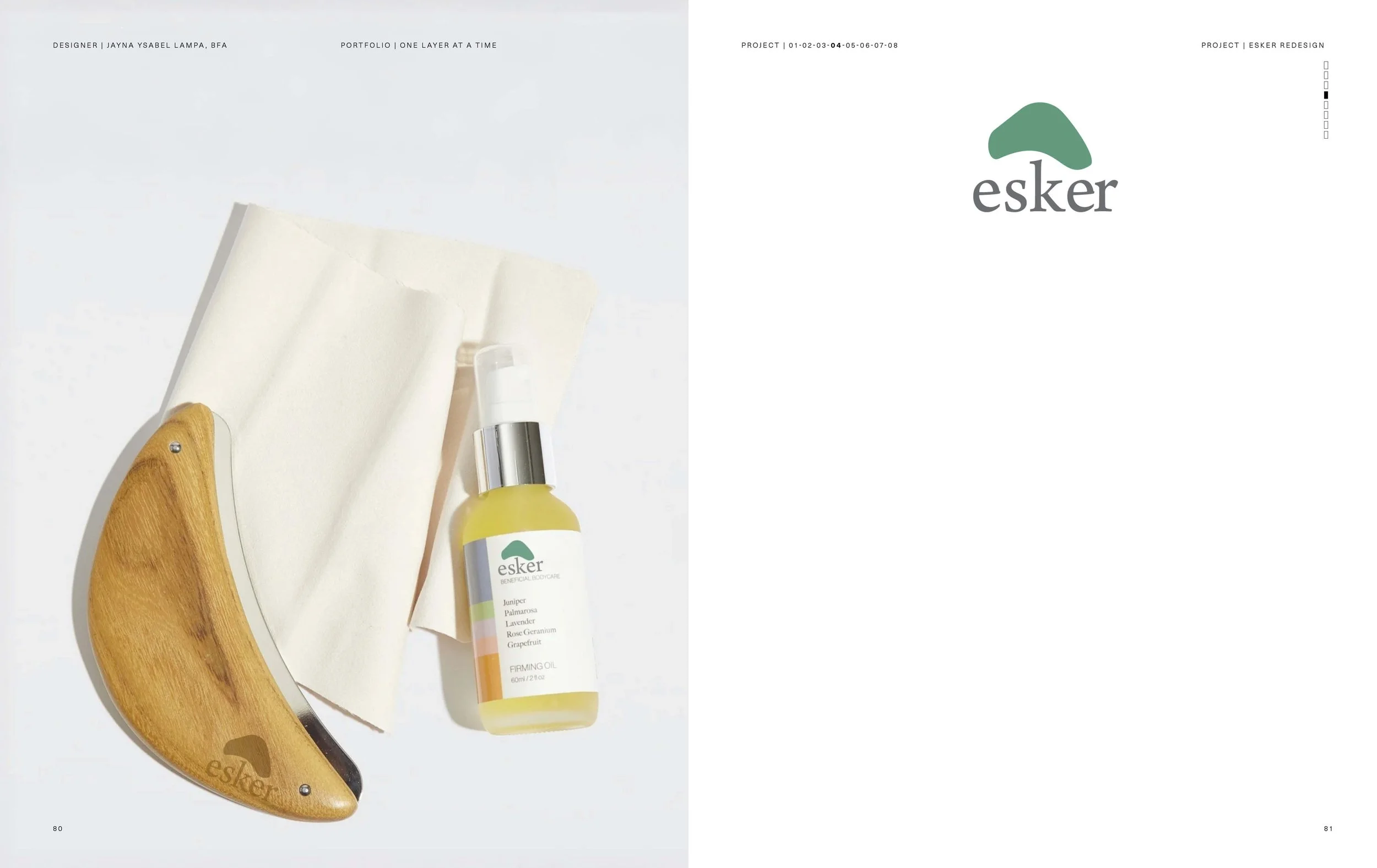
I considered how the logo would live across different applications,
ensuring that it would be versatile and functional while still
maintaining its visual identity. Ultimately, my design approach
was about building a mark that feels modern, sustainable,
and true to ESKER’s mission of bringing relaxation and renewal
into everyday life.