A book, like
design itself, is
built in layers—of
story, structure,
texture, and soul.
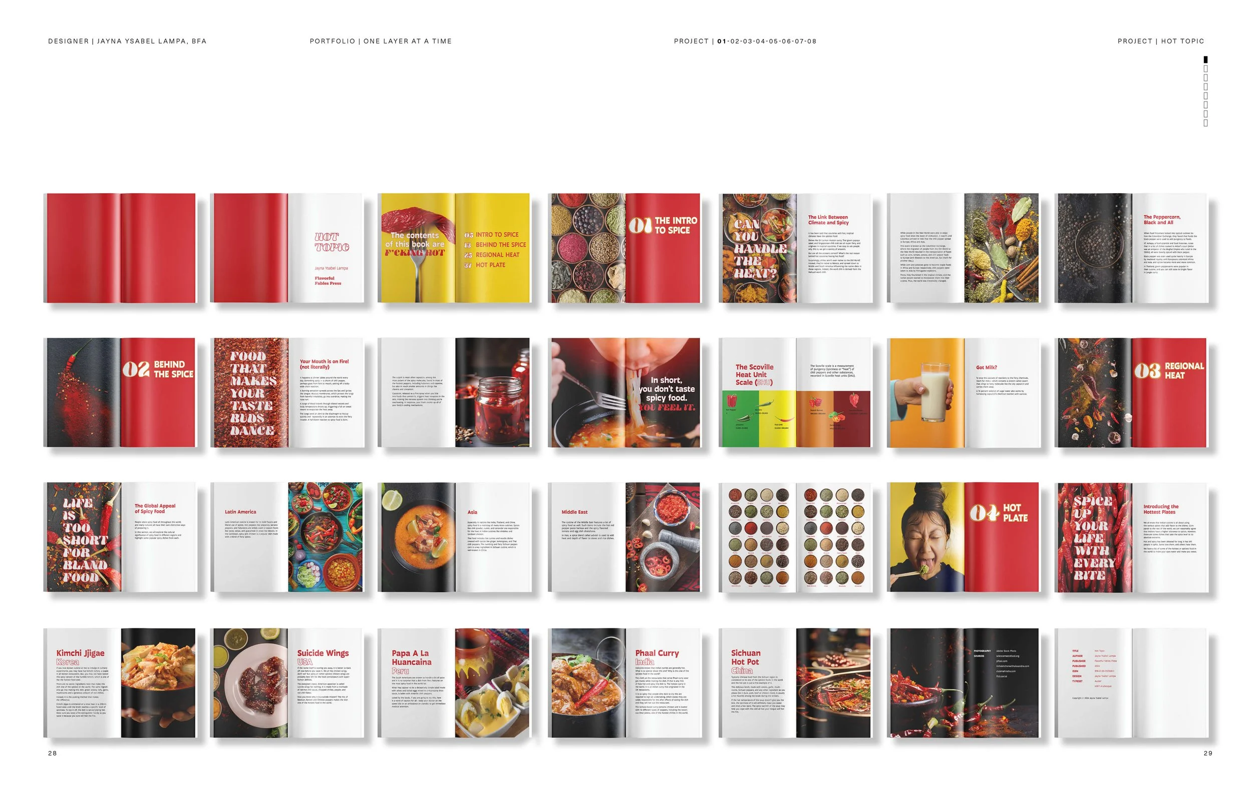
SPICE IN PRINT
Designing a book that explores the global
culture, science, and sensation of
spice through typography, hierarchy, and
narrative flow.
PROJECT ( 01/08 )
01_COURSE
GR330 TYPOGRAPHY 03
02_INSTRUCTOR
LAURIE MAKELA
03_TERM
SPRING 2024


{ LAYER 01_OBJECTIVE }
My objective was to design a book that combined research,
storytelling, and visual design to explore the cultural, historical,
and sensory dimensions of spicy food. I wanted to create an
engaging piece that felt both educational and entertaining, using
typography as the main tool to shape the reader’s experience.
{ LAYER 02_PREMISE }
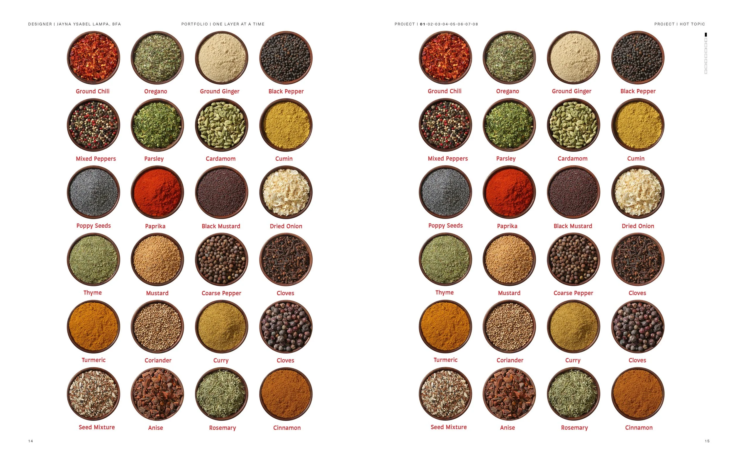
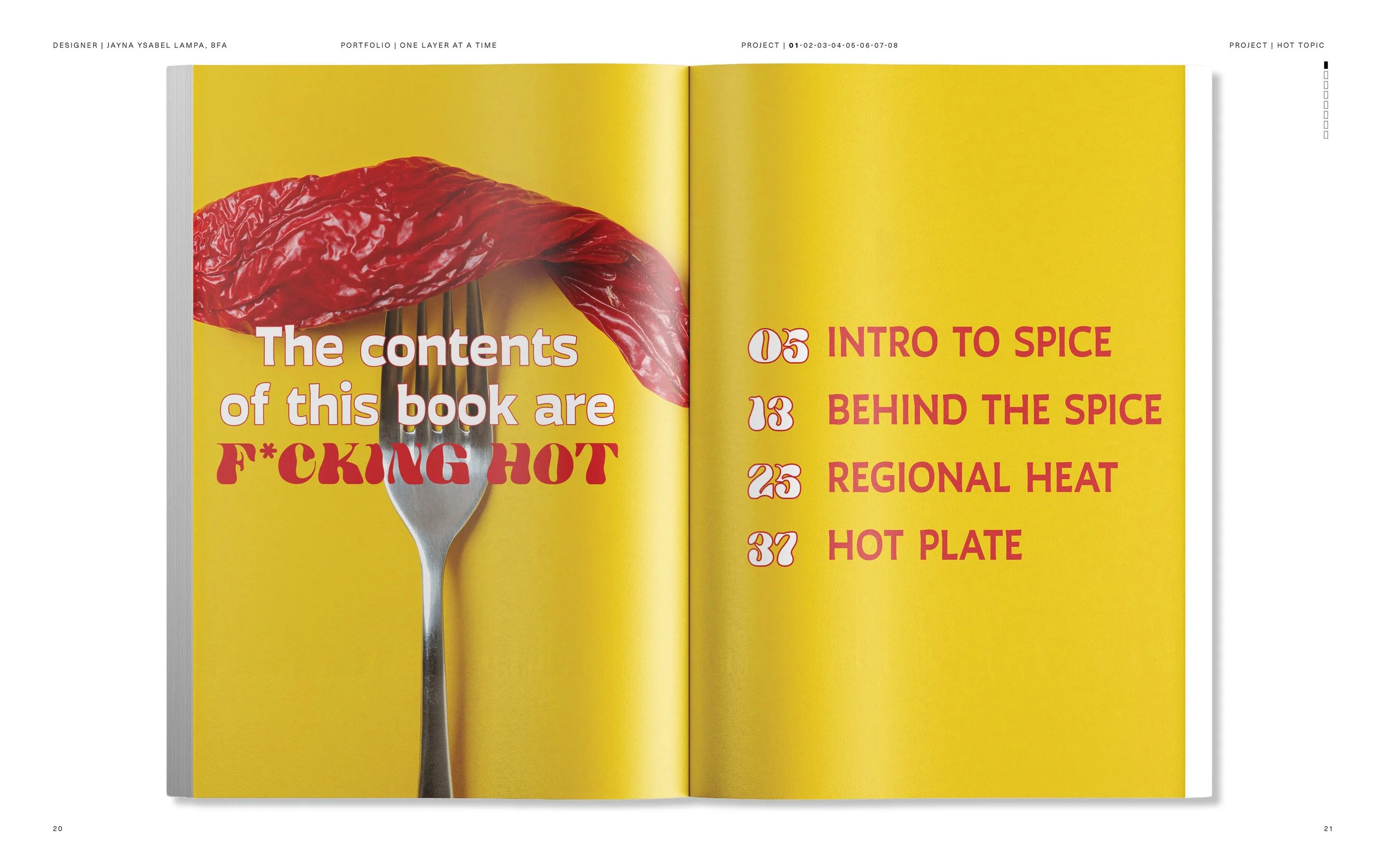
Book design can turn information into an immersive sensory
experience. By using typography, layout, and visual storytelling, I
transformed the subject of spice into a narrative that readers
could not only learn from but also feel—bringing the “heat” of the
content to life on the page.
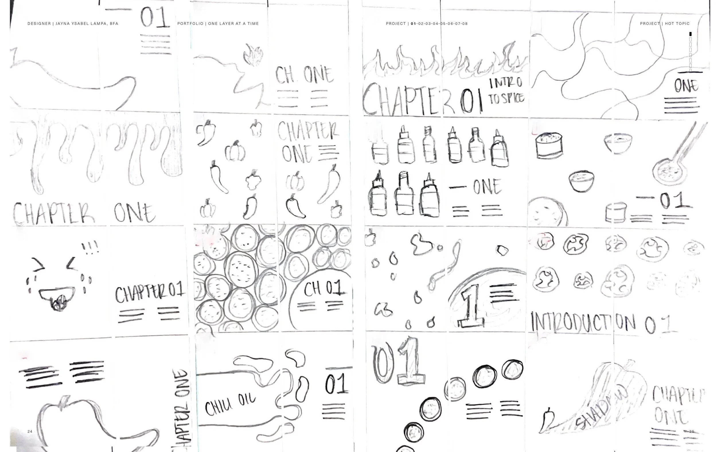
{ LAYER 03_DESIGN APPROACH }
Ultimately, I treated typography not just as a vessel for text, but
as a design element that could convey heat, rhythm, and
personality. I structured the book into clear sections to guide
readers through a narrative journey.
I used bold type treatments and playful headings to mirror the
intensity of spice while maintaining readability through clean body
text. Careful attention to grids, margins, and spacing ensured that
even with vibrant visuals, the layouts felt cohesive and balanced.